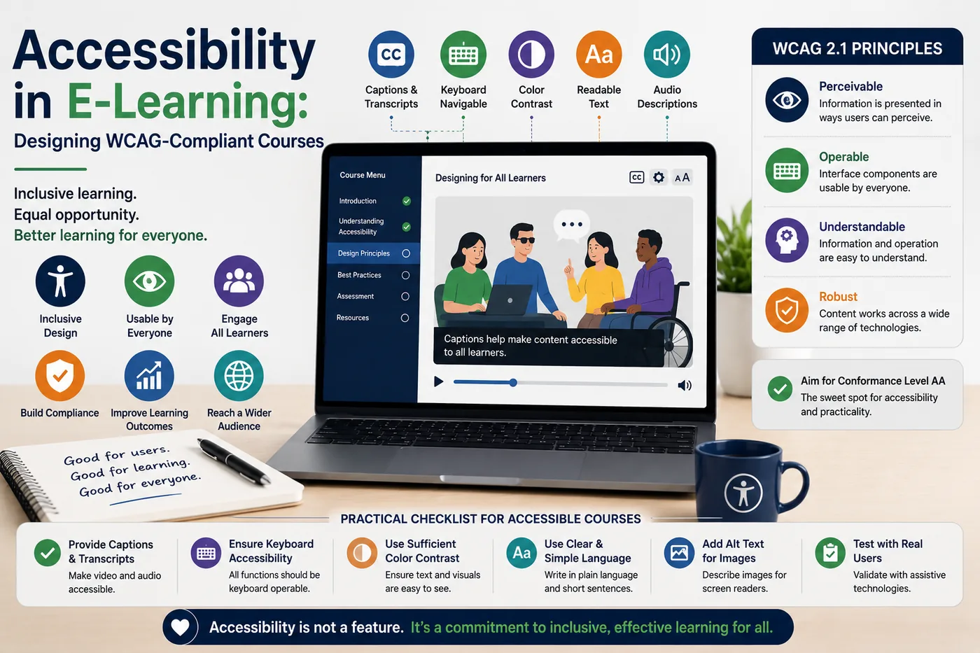
Accessibility in E-Learning: Designing WCAG-Compliant Courses
 Serve Innovate
8 min read
Serve Innovate
8 min read
Accessibility in e-learning is treated as a compliance checkbox and behaves like an architectural decision. Almost everything that makes a course accessible is settled before a single screen is built — and almost everything expensive about it comes from deciding late.
What standard you are actually being held to
For most organizations the operative target is WCAG 2.2 Level AA. It underpins the EU Accessibility Act, is the reference standard for Section 508 in the United States, and is what procurement teams increasingly write into contracts.
Level A alone is insufficient for nearly all obligations. Level AAA is not expected as a blanket target and in places conflicts with other design goals. AA is the working standard.
Two things are worth understanding about how WCAG applies to courses specifically. First, an e-learning module is a web application, so the interaction criteria apply in full — not merely the content ones. Second, if your course is launched inside an LMS, the LMS player itself is part of the learner’s path; a perfectly accessible module inside an inaccessible player is not an accessible experience.
The decisions that must happen in week one
These are cheap before build and expensive after:
- Colour palette contrast. Body text needs a 4.5:1 ratio against its background; large text and meaningful UI components need 3:1. Check the brand palette against these ratios at the start, because discovering that the corporate accent colour fails is a brand conversation, not a development ticket.
- No meaning carried by colour alone. "Click the green button" and red/green correct-incorrect feedback both fail. Pair colour with text, shape or icon.
- Interaction inventory. Decide which interaction types the course will use. Drag-and-drop, hotspots and timed challenges all require accessible alternatives, and designing those alternatives is far easier than bolting them on.
- Media plan. Captions for all video, transcripts for all audio, and audio description where visual information is not narrated. Budget for it as a line item — retro-captioning a finished library is a real cost.
- Font and layout scale. Content must remain usable at 200% zoom and reflow to a 320px width without horizontal scrolling.
The interactions that most often fail
In audits of corporate courses, the same handful of patterns account for the majority of failures.
- Drag-and-drop with no keyboard path. Every drag interaction needs an equivalent that works with Tab, arrow keys and Enter — commonly a select-then-place model. This is a genuine WCAG 2.1.1 failure, not a nice-to-have.
- Timed content that cannot be extended. Auto-advancing slides and countdown quizzes must be adjustable, extendable or dismissible unless the time limit is essential to what is being assessed.
- Focus that disappears. Modals and pop-up feedback that do not move focus into themselves leave screen-reader and keyboard users stranded behind an invisible dialog. Focus must move in, be trapped while open, and return to the trigger on close.
- Custom players without labels. A bespoke media player built from unlabelled
divelements announces nothing. Use native controls where possible; where not, use correct ARIA roles and accessible names. - Decorative images with descriptive alt text. Over-describing is its own failure — a screen-reader user working through forty slides of narrated decoration will abandon the course. Decorative images take an empty alt attribute.
- Autoplaying audio. It collides with screen-reader speech, making both unintelligible.
Testing that finds real problems
Automated tools catch roughly a third of issues — the mechanical ones. They cannot judge whether alt text is meaningful, whether the reading order makes sense, or whether an interaction is operable. A credible test pass has three layers:
- Automated scan with axe or WAVE to clear contrast errors, missing labels and structural problems quickly.
- Keyboard-only run-through. Unplug the mouse and complete the entire course, including every interaction and assessment. If you cannot finish it, neither can a learner. This single test surfaces more genuine defects than any other.
- Screen-reader pass with NVDA on Windows or VoiceOver on macOS and iOS. You are listening for whether the content makes sense in the order it is announced, not merely whether it is announced.
Where the budget allows, testing with disabled users is the only method that reveals problems all three layers miss. It is also what turns compliance into usability.
Why this is not only a compliance argument
The legal exposure is real and growing, but the operational case is stronger. Captions are used heavily by learners without hearing impairments — on shop floors, in open offices, on commutes. Clear focus indicators and logical reading order help everyone navigating quickly. Content that reflows properly works on the phones your workforce actually uses.
Accessible course design is, in most respects, simply careful course design with the ambiguity removed. The constraints it imposes — explicit labelling, predictable structure, no meaning hidden in colour or timing — tend to produce clearer training for the whole audience.
The short version
Target WCAG 2.2 AA. Settle contrast, interaction types and the media plan before build. Give every drag interaction a keyboard equivalent, manage focus in dialogs, caption everything, and never encode meaning in colour alone.
Then test with the mouse unplugged. If the course cannot be completed that way, nothing else on the checklist matters yet.
Serve Innovate
We design, build, market and scale digital experiences — e-learning, websites, campaigns and custom software — for organizations that want one accountable partner rather than four.
Work with usFrequently asked
What WCAG level do e-learning courses need to meet?
Are drag-and-drop interactions allowed in accessible e-learning?
Do e-learning videos need both captions and transcripts?
Can accessibility be added to an existing course library?
Does the LMS affect course accessibility?
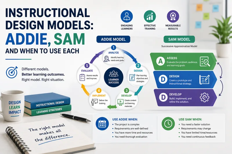
Instructional Design Models: ADDIE, SAM and When to Use Each
ADDIE is not obsolete and SAM is not automatically faster. The model that fits depends on how stable your content is and how available your experts are.
Read article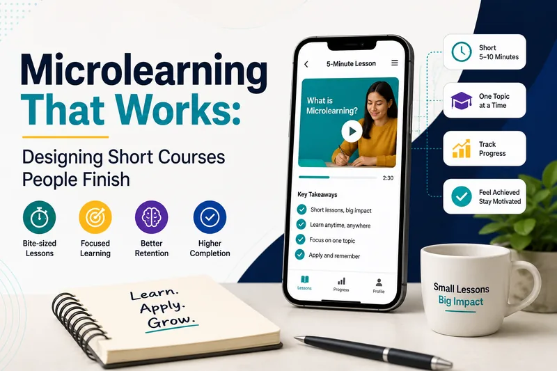
Microlearning That Works: Designing Short Courses People Finish
Cutting a two-hour course into twelve ten-minute videos is not microlearning. This is what actually makes short-form corporate training stick.
Read article